Typography: more than just pretty letters
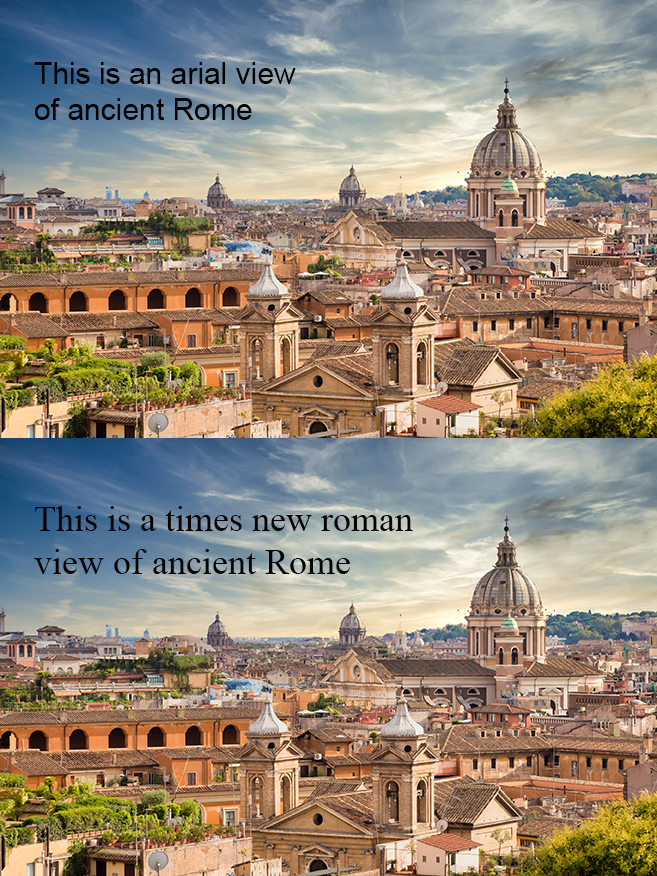
Earlier this week, a clever little image popped up on my social media feed… a side-by-side comparison of the Roman skyline, captioned with a pun – one in Arial font as an “arial view” and the other in Times New Roman. It made me laugh, but it also made me think.
Typography has always been a passion of mine and seeing that post reminded me how much we rely on type – not just for communication, but for creating tone, trust and visual identity. It was the spark that inspired this article and a good excuse to recreate the image myself (mainly to avoid stealing the original image!). While it’s just a bit of fun, it actually touches on something important in design and marketing: typography is powerful and when it’s overlooked, it shows.
Why typography deserves your attention
In marketing, typography isn’t just an aesthetic decision. It’s a strategic one. The fonts we choose impact how people perceive a message, how easily they can read it and how well they remember it. This is especially true in print, where the tactile and visual qualities of a piece work hand-in-hand.
Here are four key things to consider when choosing type for print:
1. Readability first
Never sacrifice legibility for style. Whether it’s a brochure or a poster, the primary goal is to make the message clear. Stick to fonts that are easy to read at the size and distance the material will be viewed.
2. Fit the typeface to the medium
Brochures benefit from fonts with a good text flow and a defined hierarchy – ideal for guiding the reader through structured content.
Posters need bold, eye-catching fonts that command attention quickly, often from a distance.
Business cards demand clean, crisp typography that reflects professionalism and is legible even in smaller sizes.
3. Keep it consistent
Using a consistent set of typefaces across all materials reinforces brand identity and creates a sense of cohesion. It builds trust and makes your communications look considered and professional.
4. Typography is design
It’s not just about font selection. It’s also about spacing, alignment and hierarchy. Typography guides the reader’s eye and sets the rhythm of the design. Even small details like line height and letter spacing can drastically affect the overall feel of your print.
In conclusion: A note on spelling (and a font joke that says it all)
That social media post? It wasn’t just a font joke. It was also a perfect example of why the details matter. The phrase “arial view” (when it should have been “aerial view”) shows how a single misspelling can unintentionally create confusion – or comedy.
In marketing, details like spelling, punctuation and typography aren’t just cosmetic. They shape how people perceive your brand. A small oversight can turn a polished design into a punchline.
So yes, have fun with fonts (we do!). But also remember… great typography is thoughtful typography. It’s consistent, appropriate, legible and executed with care. It’s what turns good design into great communication.